Clicking the AWFlow icon in your browser toolbar opens the app in Chrome’s side panel, next to the page you’re working on. You can keep the page and your workflows side by side: pick elements, run a workflow, and watch its results without switching tabs.
The side panel starts narrow (about 320–450px), and you can drag its left edge to make it wider. The app adapts to whatever width you give it.
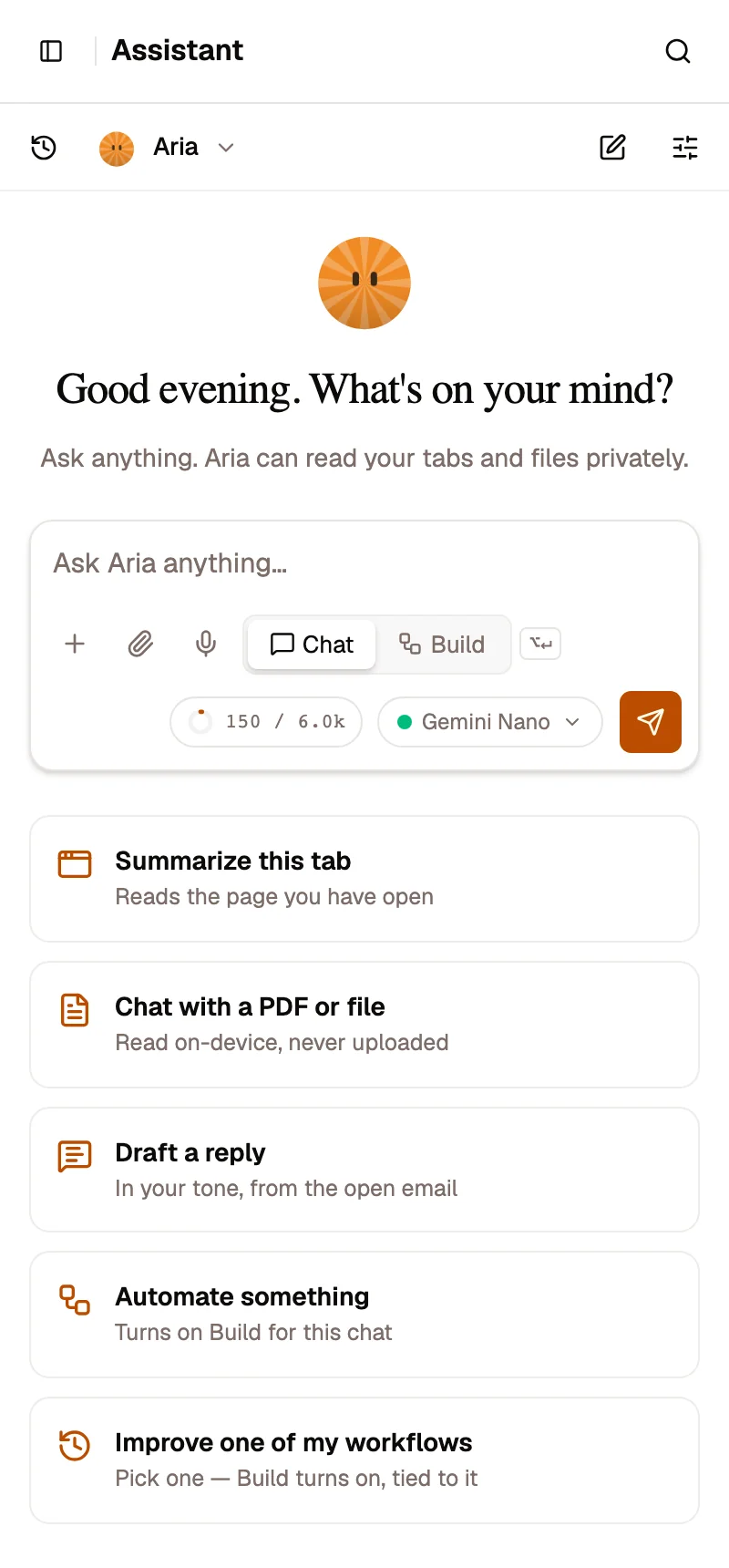
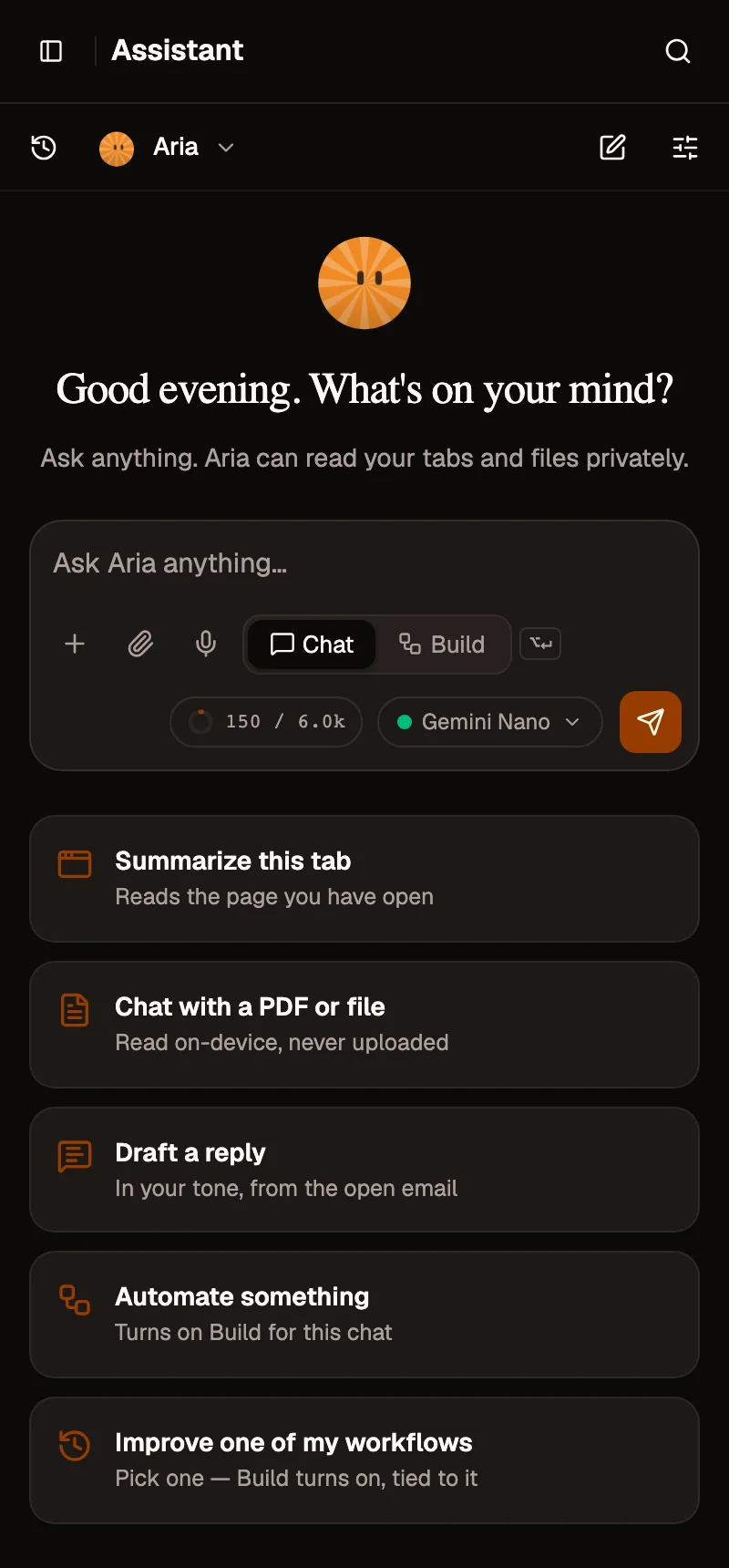
- Sidebar button: opens the full navigation
- Message box: ask Aria anything
- Chat or Build mode
- Model picker
Opening it
Section titled “Opening it”- Click the AWFlow icon in the toolbar. If you don’t see it, open the puzzle-piece Extensions menu and pin it.
- Click the icon again, or use the panel’s close button, to hide it. Your work stays where you left it.
What changes when the panel is narrow
Section titled “What changes when the panel is narrow”To fit the panel, the app rearranges itself instead of cutting things off:
- Header. It shows the name of the page you’re on, a search icon (it opens the same search as ⌘/Ctrl + K), and notifications. The sidebar button (top left) opens the full navigation.
- Lists (workflows, credentials, knowledge bases, memory, published workflows). Each item is a compact two-line row with its status and a ⋯ menu. The New button is always visible next to the tabs.
- Forms (new credential, new knowledge base…). They open as a full-height sheet, with the Save/Create button pinned to the bottom.
- Workflow canvas.
- The Editor / Logs / Runs switch gets its own row under the header.
- The canvas tools sit in a single vertical rail.
- Add a node opens as a sheet from the bottom.
- Node settings open as a full-height sheet.
- The minimap is hidden until the panel is wide enough.
- Runs. Tap a run in the list to open its details, and use ‹ Runs to go back.
- Settings. Settings shows a list of sections with their current state (for example “Usage stats on”). Tap one to open it, and use ‹ Settings to go back.
- Assistant. Your chat history opens as a drawer from the history icon.
- Marketplace. On a workflow’s page, the Install button stays pinned at the bottom of the panel while you read about it.
Making it wider
Section titled “Making it wider”Drag the panel’s left edge to widen it. At around 450px, headers fit on one line. From around 670px, full tables, the canvas minimap, split views and side-by-side layouts come back, as in a regular tab.